16.4.15

Michael Farrell is an agile performer.
You feel there's a language being created here
and yet it's your own language.

                             LAURIE DUGGAN


   Michael Farrell looking for his pocket notebook at the launch of 'Cocky's Joy'
   with Astrid Lorange, Aden Rolfe, Sam Moginie at First Draft, Wooloomooloo, Sydney
   photo by Melissa Hardie 15.4.15

Michael Farrell has so much to say about Australian history, popular culture and the field of poetics in this often hilarious yet totally indubitable collection that you'll need to take a few days off work to read and ingest what's going on. It's a kinetic tour de force. US poet Forrest Gander says that Michael is "A pentathlete of innovative form" and that's spot on.

In her launch talk, amongst many other astute comments, Astrid Lorange said "I joke with Michael about the fact that he’s often described as the ‘premier’ experimental poet in Australia. We joke about the word premier, its bucreaucratised whiff of the avant-garde. We joke about the word experimental, here imagined as an aesthetics of ratbaggery or tomfoolery. We joke about the insistence of dominant modes of literary criticism to read contemporary innovations in poetry as difficult, obtuse, wilfully obscure, inaccessible, ‘academic’, or coded. We joke about this stuff because it is almost entirely irrelevant to the actuality of Michael’s work. As anyone who reads Michael will know, his poetry is – far from an attempt to lead as though into battle or office a pack of specialist-poets – an enormously generous contribution to the diverse and intersecting communities of practice that coalesce around questions, propositions, readerships, textualities, affections, socialities, and so on. Michael’s work, which in its spirit and discipline is a constant and intense gift, is ever-labouring towards a poetry that might continue, despite it all, as a liveable form of loving."

Published by Giramondo.


31.3.15

Looking west

Writer, poet & curator, John Mateer will be visiting Canberra and Sydney in April with a new book, The Quiet Slave. The book is the outcome of a two year long research project conducted as part of future recall at spaced2.

The Quiet Slave is an historical fiction set in the early 19th Century that describes the first years of settlement on the Cocos-Keeling Islands, an atoll – now an Australian Indian Ocean Territory – midway between Perth and Sri Lanka. The events are seen through the eyes of Rosie, a female Malay slave belonging to the controversial English colonial Alexander Hare. Hare employed John Clunies-Ross until conflict between them ultimately led to the abandonment of the Malays on the island for the next 140 years, during which period the islands belonged to the Clunies-Ross dynasty. Beyond simply describing the process of settlement of the uninhabited atoll, Rosie's story is an insight into the origin and lives of the slaves who, like her, were brought from various parts of the 'Malay Archipelago' and into the complex circumstances of the last days of Western slavery.

Conceived over a two-year period in the rural Western Australian town of Katanning and on the Cocos-Keeling Islands, the book is published in John Mateer's original English and the Malay translation of the Singaporean Nur-El-Hudda Jaffar. It is illustrated with a selection of photographs taken during one of the United Nations' decolonization mission to the islands in the 1980s.

A brief interview with John Mateer about the project -

For details of the book launch in Canberra
on Monday 13th April click here

For a seminar on the project at the Centre for Writing and Society
at University of Western Sydney
on Friday morning, April 17th click here

John Mateer has published several books of poetry & prose. He convened the 2013 symposium The Ambiguity of our Geography at Perth Institute of Contemporary Arts, as part In Confidence: Reorientations in Recent Art, the Indian Ocean-focused exhibition he curated for that institution. Currently he is an honorary research fellow at the University of Western Australia, researching traces of the explorer William Dampier's voyages in Robinson Crusoe and Gulliver's Travels.


13.3.15

From the "condensery":

Lorine Niedecker's xmas gift to a friend, Maude Hartel, in 1964, A Cooking Book is a warmhearted humorous book of short (and typically 'whittled down') poems about the uses and preparation of certain foods, especially rutabaga (known in Australia as 'swedes') and sauerkraut. With plenty of advice and anecdotes from 'Al' and various asides from the poet this is a booklet to cherish.

       But Al seems to know
     about cooking - he grew up in
     the north woods near Paul
     Bunyan and ate close to
     the soil. He reads while he eats.

       Away from the table: I eat
     books.

It's published by Bob and Susan Arnold's Longhouse in Vermont.
Visit the site here

       Liquor in food - sure,
     pour wine over cabbage and
     over almost anything.


26.2.15

Thanks to Michael Tod Edgerton, alongside many others I have a few poems here in the current issue of Loose Change - the contents are here and Marthe Reed has a portfolio of montage including the cover image above - at this link. As usual, click to enlarge the images.


9.1.15

Test Results : Book Launch, Talk and Gallery Viewing
Saturday 21st March at 11 a.m.
Shoalhaven Regional Gallery
12 Berry St, Nowra
Street map - click here

Kurt Brereton has produced a series of paintings on the topic of virality i.e. the role of different kinds of viruses in culture and specifically art as a virus. The book, Test Results, is available now in limited edition. Preface by George Alexander. For further information contact the artist via his website - Kurt Brereton


18.12.14

2.12.14

A short talk by Chris Edwards, poet, designer, typesetter and collagist, on designing Vagabond Press' deciBels poetry books - delivered at the launch on Sunday afternoon, November 30th, 2014 :

                     deciBels / design

I’ve been asked to say a few words about designing the deciBels series, and specifically to talk about fonts. So I ask myself, what is a font? Keith Chi-hang Tam, in Digital typography: a primer, explains that “a digital font … is a piece of computer software that contains a collection of vector ‘drawings’ along with spacing and kerning data that can be accessed through the keyboard.” As he points out, “these ‘drawings’ are often letters which, when combined sensibly, form meaningful words.”

Now, there are two fonts — two “collection[s] of … drawings” — used to form meaningful words in these books. The body typeface — the font used for the poems themselves — is Adobe Minion Pro. Minion was designed and drawn by Robert Slimbach for Adobe Systems in 1990. It’s a serifed typeface in the “classical tradition” — which, according to Paul Caputo writing in the IBD Blog, is “designer code for ‘It was designed to look like pretty much every other serifed typeface out there.’” Caputo goes on to say that Minion “is one of those typefaces that only a typographer could love (not that other people dislike it; they just don’t notice it). If Minion were at a high school dance,” he says, “it would sip punch with its back against the wall, trying not to make any sudden movements …” “There’s nothing,” he adds, “to dislike about Minion. Sure, typographers who like to argue about the tiniest of details will say things like, ‘The slight upward angle of the cross-stroke of the lower-case e is too whimsical,’ but it’s expertly designed to maximize legibility, and the practical advantages to most designers are immeasurable.” Minion contains more glyphs than most other fonts and comes in multiple weights as well as old-style letterforms and small caps. This makes it flexible, which along with its legibility helps it to blend into the background, letting the content take centre stage.

It’s common typographic practice to team a serif body typeface with sans-serif headers, and that’s what we’ve done here. For book titles, author’s names, poem titles and so on, we’ve used a font called Swiss 721 — Black Condensed for book titles, Bold Condensed for authors’ names. Swiss 721 is really Helvetica under a different name, with a few very subtle variations. Helvetica, in fact, means Swiss. Swiss 721 was cloned from Helvetica in 1982 by the Bistream type foundry. I may of course be imagining things, but I like to think that its condensed weights are slightly more elegant than those of Helvetica, which is why I suggested using it, but Swiss and Helvetica are essentially the same font. So, what can I tell you about Helvetica?

Helvetica was designed in the late 1950s by Edouard Hoffmann, director of the Haas Type foundry, and drawn by Max Miedinger under his guidance. They were trying to improve on the popular late-nineteenth-century typeface Akzidenz Grotesk, from the Berthold type foundry. Personally, I’m not sure they succeeded, but a lot of other people seem to think they did. Four years after its release as Haas Neue Grotesk, Hoffmann and Miedinger’s font was reworked for the Linotype Company and re-released as Helvetica, which, during the 1960s, displaced Futura as the most popular sans serif typeface in the world. Since then, Helvetica has become ubiquitous. Linotype’s restrictive licensing policies are sometimes blamed for the large number of unauthorized copies, and may also have played a role in generating genuinely re-worked versions like Swiss 721. Stephen Coles, writing on the FontFeed website, says that “there are many reasons why Helvetica is so widespread, the most obvious being that a few weights have been bundled with the Mac Operating System for years. It is arguably the most respectable of the ‘default’ fonts. But it’s also used because it’s a safe, neutral choice. For many purposes, typography is more about content than style. Fans of Beatrice Warde will tell you that typographers should communicate without distraction. Helvetica, with its simple, unadorned forms, is the perfect crystal goblet. Even its ubiquity contributes to its neutrality — letters so common they become invisible.”

So, Swiss 721, to sum up, is the market-driven clone of a collection of drawings whose aim is to be invisible.

I should explain at this point that although the design and typography of this first deciBels series are attributed (inside the books) to me, the design in particular was collaborative. When Michael first told me about his deciBels idea, and explained that he’d asked Pam — and she’d agreed — to edit this first series, I seem to remember Mike stipulating some kind of design continuity for the set of 10 books, and I certainly remember him telling me that Pam had some definite ideas about the design. It’s part of Michael’s brief for the deciBels series — not just this one, but future series as well — that “form and genre are open and up to the editor, as is the design and format.” It was Pam who suggested a small, square format and type-only covers that were simple and uncluttered. I came up with some font suggestions, a few dummy layouts for the covers, and various ideas for a deciBels motif, and Pam chose those she liked best.

I constructed a basic shell for the covers early in the piece, and as manuscripts arrived we began selecting colours. I made the initial choices, and some of them were more or less rational: the cover of Stephanie Christie’s The Facts of Light is a photograph of the sky looking from Bondi toward New Zealand, the musk-stick pink and cherry red of Ann Vickery’s The Complete Pocketbook of Swoon are, potentially at least, reminiscent of school-yard crushes, Toby Fitch’s Jerilderies may be bush colours at dawn or maybe bushfire colours at midnight, and Rachel Loden’s Kulchur Girl more or less chose its own colours: those of the ticket documenting Rachel’s attendance at the Berkeley Poetry Conference of 1965. More often I chose instinctively, in ways I’d rather not analyse, and my choices were then worked over with Pam, either by email or at my computer. Pam, I discovered, is a skilled tweaker, with a fine eye for subtlety and detail — very easy to work with, too. The only difficulty I encountered, in the various sessions we had together, was deciding what to have for lunch.


The poets also collaborated (knowingly or not) on the internal design. It’s not my role to talk today about the contents of the books, but I will say — regarding what are technically called their “innards” — that from a typographer’s point of view, it’s been a pleasure to work on such a stylistically diverse range of books. If the fonts we’ve used — Minion and Swiss — do succeed in disappearing, or at least blending into the background, it’s partly due to the formal variety on display here, not only between books but often within them. One poet, Toby Fitch, typeset his own book using deciBels fonts and style sheets. He took liberties with the style sheets in keeping with the style of his poems, and I, too, found it necessary to adapt or augment our standard styles for other books in the series. You might notice, if you look closely, that all ten share the same fonts and so on — the same typographic style — but what you notice first, I think, is that their compositional styles are all different. That’s the visible part.

Coordinating a project like this is a huge job, so I might end with an appropriately huge thank you to Michael Brennan, who came up with the idea and went to a great deal of trouble to ensure that the end results were as good as they possibly could be, and that they were delivered on time, and to Liz Allen for organising today’s launch, for housing the books temporarily in her home, and for seeing to it that they make their way in the world. I’d also like to extend my warmest congratulations — to all ten the authors on their individual books, each of which is well worth celebrating in its own right, to Pam who chose them and to Michael who chose Pam to edit the first of the deciBels series. Let’s hope we see many more.


1.12.14


I want to draw attention to a short pamphlet recently published by Wave Books. It's called Freely Frayed,ᄏ=q, & Race=Nation and comprises three brief but powerful talks given by Don Mee Choi at a couple of conferences in the USA earlier this year. Here are two brief extracts from ᄏ=q - the central talk : click on the images to enlarge the text :

For further information and/or to buy a copy click here

Don Mee Choi's booklet Petite Manifesto was launched
by Vagabond Press in Sydney this week.

For further information and/or to buy a copy click here


9.11.14

Vagabond Press invites you to celebrate
the launch of the 'deciBels series'
in Sydney & Melbourne


New state-of-the-art poetry by Anselm Berrigan, Don Mee Choi
Stephanie Christie, Toby Fitch, Angela Gardner, Jaimie Gusman
Rachel Loden, Susan M. Schultz, Ann Vickery & Maged Zaher

Series edited by Pam Brown
& designed by Chris Edwards.

With the completion of the iconic Rare Objects series in 2014, the deciBels series was established to open the Vagabond list to fresh poetry & new forms for the years to come. Over the next few years, Vagabond Press will collaborate with guest editors to bring together sets of ten works. Form & genre are open & up to the editor, as is the design & format. Transnational, working across styles & categories, the deciBels is an experiment in publishing, aimed at taking the press & its readers off on new vectors. One editor, ten contributors, wide open space.

To be launched in Sydney
by Pam Brown & Chris Edwards

with readings in person by
Angela Gardner, Toby Fitch & Ann Vickery
& Anselm Berrigan, Don Mee Choi, Stephanie Christie,
Jaimie Gusman, Susan M.Schultz & Maged Zaher
appearing via Skype from Hamilton, NZ & Seattle,
New York & Hawai'i, USA.

IN SYDNEY

3.30pm Sunday 30th November

where -
gleebooks, upstairs
49 Glebe Point Road
Glebe, Sydney

everyone welcome

For more information & rsvp click here


IN MELBOURNE

no skyping, but the scintillating Justin Clemens
will launch the deciBels series

Angela Gardner, Ann Vickery & Toby Fitch will read

Chris Edwards will perform work from his new book
After Naptime

(hosted by Liz Allen & Pam Brown)

6pm Wednesday 10th December
where -
The Alderman Hotel
134 Lygon Street
East Brunswick

everyone welcome


For information on each of the books visit Vagabond Press
Scroll down & click on the book covers to read about each poet & notes on the books

If you can't come to the launch party
you can order copies at the website here.


4.11.14

Today I read Citizen, a very powerful, succinct book by Claudia Rankine - it tells exactly what it is like to be a black citizen in the USA and is important everywhere for those concerned about racism - it is also, in the face of sorrowful everyday realities, a work of art. (It's published by Graywolf Press)


3.11.14

JON CATTAPAN - ‘I’LL BE YOUR MIRROR’
PAINTINGS, DRAWINGS, MONOTYPES

Dominik Mersch Gallery
1/75 McLachlan Avenue
Rushcutters Bay
Sydney
16th October until 15th November 2014
Further information here


15.9.14

'deciBels'
Presenting ten square format booklets from Vagabond Press:

New work by Anselm Berrigan, Don Mee Choi
Stephanie Christie, Toby Fitch, Angela Gardner,
Jaimie Gusman, Rachel Loden, Susan M. Schultz
Ann Vickery & Maged Zaher.

Series edited by Pam Brown & designed by Chris Edwards.

For more information - biographies of the poets & notes on the work -
please visit Vagabond Press
While you're there you can pre-order copies of these exciting booklets.


10.9.14


Seizure Magazine is doing a series of Late Night Library events
in Haymarket, Sydney. ALL CUT UP is on the 1st of October:
an evening of collage poetry featuring readings by Kate Fagan,
Pam Brown and Chris Edwards.

WHAT:
(the blurb) Hosted by Toby Fitch and featuring work from three contemporary Australian poets writing in the anti-tradition of collage, 'All Cut Up' is a night for new poetry. The readings will lead provocatively into a hands-on collaging session where the programmed poets will each provide unusual source material (government docs, etiquette books, who knows...?) for attendees to chop up and recombine in whatever illicit way they see fit.
Scissors and glue provided. BYO mental shears and word processors (if you prefer electronic cut-and-paste).

There will also be wine and cheese.

WHO:
KATE FAGAN — poet and musician whose books include First Light (Giramondo Publishing)and The Long Moment (Salt Publishing).

PAM BROWN — poet of 17 books including Home by Dark (Shearsman), Authentic Local (papertiger press), True Thoughts (Salt Publishing),and Alibis (with French translations, Lulu).

CHRIS EDWARDS — poet and editor whose books include After Naptime (Vagabond Press),People of Earth (Vagabond Press), and A Fluke: A mistranslation of Mallarme's Un Coup de Des (Monogene).

TOBY FITCH — poet of Jerilderies (deciBels series, Vagabond Press),Rawshock (Puncher & Wattmann) and Quarrels (Stale dePress).

WHERE:
Haymarket Library is on the corner of George St & Hay St,
on the Capitol theatre side.

WHEN:
Wednesday 1st October, 8-9pm sharp
so get there from 7:30 onwards.

HOW MUCH:
Free! But book here! because it's a small space.


8.9.14

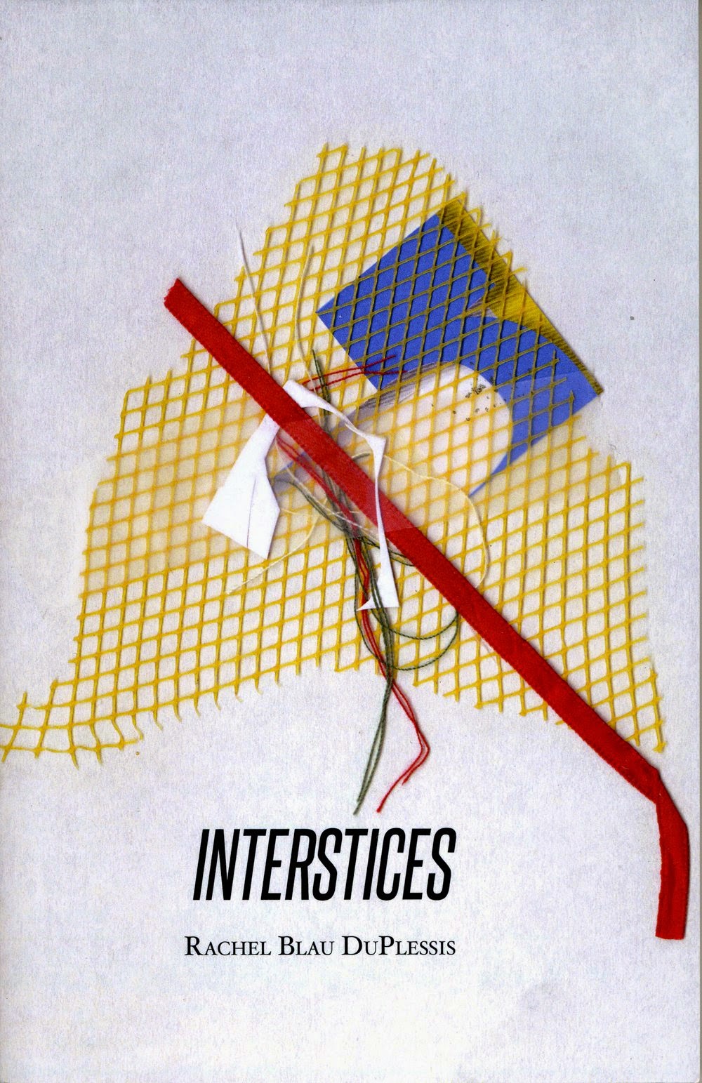
I've added some recent reviews to Extras on the 'the deletions' side bar - including my review of two books by Jane Joritz-Nakagawa in Plumwood Mountain and a speechette I made at the launch of Kent MacCarter's new book Sputnik's Cousin in Sydney in early August. It was published in Rochford Street Review. The most recent is from The Critical Flame - a review of Rachel Blau DuPlessis' latest collection Interstices published on September 8th.


23.8.14

We went to the lively and crowded Haldon Street Festival in Lakemba, Sydney today. You can see some more photos of
this annual multi-cultural celebration here.


1.8.14

Sputnik's Cousin takes off in Sydney

You are invited to celebrate the Sydney launch of Sputnik's Cousin
by poet and Cordite Poetry Review editor, Kent MacCarter

Bonny Cassidy, Ross Gibson and I will be praising this incredibly unpredictable book by Melbourne-based Kent MacCarter who has published just about every contemporary and past Australian poet in Cordite Poetry Review.

Gleebooks, Thursday August 7th 6 for 6.30pm

For event information, address etc follow this link

Everyone welcome
Hope to see you there


29.7.14

new art writing

A Rainbow Reader is a work of creative non-fiction which looks at colour from the personal perspective of Tessa Laird, an artist, writer and lecturer based in New Zealand.
'In 2009, Tessa Laird began investigating the (r)evolutionary power of colour, from a personal, and political, transformative angle. A Rainbow Reader is the result of that study. Consisting of six chapters, one on each spectral hue, colour becomes a catalyst for speculative writing encompassing art history, literary criticism, personal anecdote, philosophy and anthropology. Each chapter of A Rainbow Reader is bound in the appropriately coloured card; together, the six chapters form a rainbow spine and operate as a kind of edition-based artwork, a veritable rainbow on your bookshelf.' (notes from the publisher)


A Rainbow Reader is published by Auckland-based art books press Clouds. Further information - here.


The Dark Horsey Form Guide, Archive & Punter's Companion
Critical writing by Ken Bolton

METHOD FOR FORM'S SAKE

Sarah crowEST — A Serious Of Objects — Australian Experimental Art Foundation, May 22nd—June 28th
Sam Howie — Survey — and Return Threshold—Patrick Hartigan, Michelle Nikou, Marcin Kobylecki, Charlie Sofo—Fontanelle, May 18th—June 8th
Peter Atkins — Silence — and James Guerts—Topography Of Water—Greenaway Art Gallery, May 28th—June 22nd
Juz Kitson — Still Life: Sleep of non-being — Greenaway Art Gallery, June 25th—July 25th
Joe Felber — Kontaktraum : Auslander (space of contact—foreigner)— Contemporary Art Centre of South Australia, June 13th—July 13th

Download pdf here.
Earlier Form Guides available here


15.7.14

It's impossible to synthesise or to summarise the extraordinary poetic poeises of the last couple of weeks. It began with the CONTEMPORARY WOMEN’S WRITING AND ENVIRONMENTS conference at the State Library in Melbourne, Victoria from the 3rd until 5th July comprising dozens of brilliant contributions and five great keynote speakers Chris Kraus, Lyn Hejinian, Alexis Wright, Kate Rigby & Deborah Bird Rose.
See the entire program here.


Immediately following the Melbourne conference, EXPERIMENTAL, convened by Associate Professor Kate Lilley, Director of Creative Writing at the English Department, University of Sydney, began on Sunday July 6th with a mistress class by Carla Harryman and continued the following morning with an official program that can be viewed here.

The information -
Join us for a pre-symposium reading at Gleebooks on June 30th, 6 for 6.30pm with Pam Brown, John Tranter and John Wilkinson.

This exciting 2 day symposium on experimental writing and poetics features Carla Harryman, Lyn Hejinian and Barrett Watten, three of the most significant and influential architects of the movement which has come to be known as Language writing, live and in person. The important English poet-critic, John Wilkinson, will also give a keynote reading. A fantastic lineup of participants from around Australia includes: Pam Brown, Andy Carruthers, Kate Fagan, Toby Fitch, Anna Gibbs, Ross Gibson, Melissa Hardie, Luke Harley, Martin Harrison, Fiona Hile, Eddie Hopely, Ella O’Keefe, Astrid Lorange, Kate Lilley, Philip Mead, Peter Minter, Sam Moginie, Gig Ryan, Chris Rudge, Ann Vickery, Corey Wakeling and Jess Wilkinson.

The Symposium will end with a celebratory reading at Sappho Books, 51 Glebe Point Rd, Sydney, July 8, 7pm.


L t R : Karen Sonnenschein, Pam Brown, Nola Farman, Kate Lilley, Lyn Hejinian
& Carla Harryman at Sappho's (foto by Luke Harley)


Kate Lilley & Barrett Watten at Sappho's (foto by Luke Harley)


Lyn Hejinian heard by Astrid Lorange, University of Western Sydney

On Wednesday 9th July Kate Fagan, poet and Lecturer in Literary Studies at the Writing & Society Research Centre,University of Western Sydney hosted a reading and conversation with Lyn Hejinian. Lyn read 'Lola' a chapbook segment from her book Saga/ Circus and a selection from her latest book The Book of a Thousand Eyes. After morning tea, Lyn Hejinian and Kate Fagan conducted a fascinating conversation with participation from the audience.
There are more photos of this event here and here's my photo of one member of the audience, poet and recent PhD recipient, Andy (Ampersandy) Carruthers :

& here's Ampersandy's photo of me talking with blurry Sam Moginie & Ella O'Keefe at the same event:


20.6.14

A Sue Ford Retrospective

In 1962, at the age of 19, Sue Ford was one of only two women enrolled in the photography course at the Royal Melbourne Institute of Technology (RMIT). She continued making photographic work throughout her life. Sue and I became good friends in the late seventies. Sadly, Sue died in 2009 (noted here - obituaries can be found here and here.) Now the National Gallery of Victoria is exhibiting a retrospective of her work at the Ian Potter Centre in Melbourne. It runs until August 24th. You can find information here and here. Read two reviews here and here.

the deletions presents a sample of photos from her life and work
(as usual, click on the images to enlarge them):


Reel Women, a feminist filmmaking group, Victoria, 1981 (Sue is at the rear of the ute)


Ben Ford (who has helped curate the NGV exhibition) & his mother Sue in 1980
photo by Micky Allan


Micky Allan, 1975, photo by Sue Ford


Shadow Portraits by Sue Ford, National Gallery of Victoria, 1994


Discussions Between Bob Hawke and Galarrwuy Yunupingu
(Galwarrway is painted with his father’s body design from the Gumatj clan)
by Sue Ford 1988
(courtesy the Estate of Sue Ford and Arc One Gallery, Melbourne)


Sue Ford -Self-Portrait 2004 (courtesy the Estate of Sue Ford
and Arc One Gallery, Melbourne)


Snapshot - Sue & crazy-smiling Pam, Sydney 1982


And The Road, another photographic exhibition including work by Micky Allan and Virginia Coventry, and other friends and colleagues of Sue Ford is showing in Melbourne at Monash Gallery of Art this winter :


click on the gallery invitation to enlarge it